MIXY
Brand strategy, visual identity, packaging design, brand voice, brand guidelines, marketing collateral
The Challenge:
Let’s dive into the inspiring journey of a client who started a small side hustle with a big dream. Seeking to elevate her business to new heights, she was in search of a designer who could truly grasp her vision and bring it to life.
Together, we embarked on a collaborative journey, crafting a brand that would empower her to stand out and captivate her target audience.
Join us as we explore the transformative process that propelled her brand from a humble beginning to an exciting new chapter of growth and success.
The Goal:
Develop new brand identity
Attract & educate audience
Create package design
Identify brand differentiators
The
Solution:
Where We Started
Client Dislikes:
Client Likes:
fun, punchy colors
leveraging ingredients
trendy copy
poor customer experience
brand personality
retail packaging
Logo Design
Concepts that didn’t make the final cut
Color Palette
In crafting the brand identity for our client, we opted for bright, fun colors to align with the essence of her product.
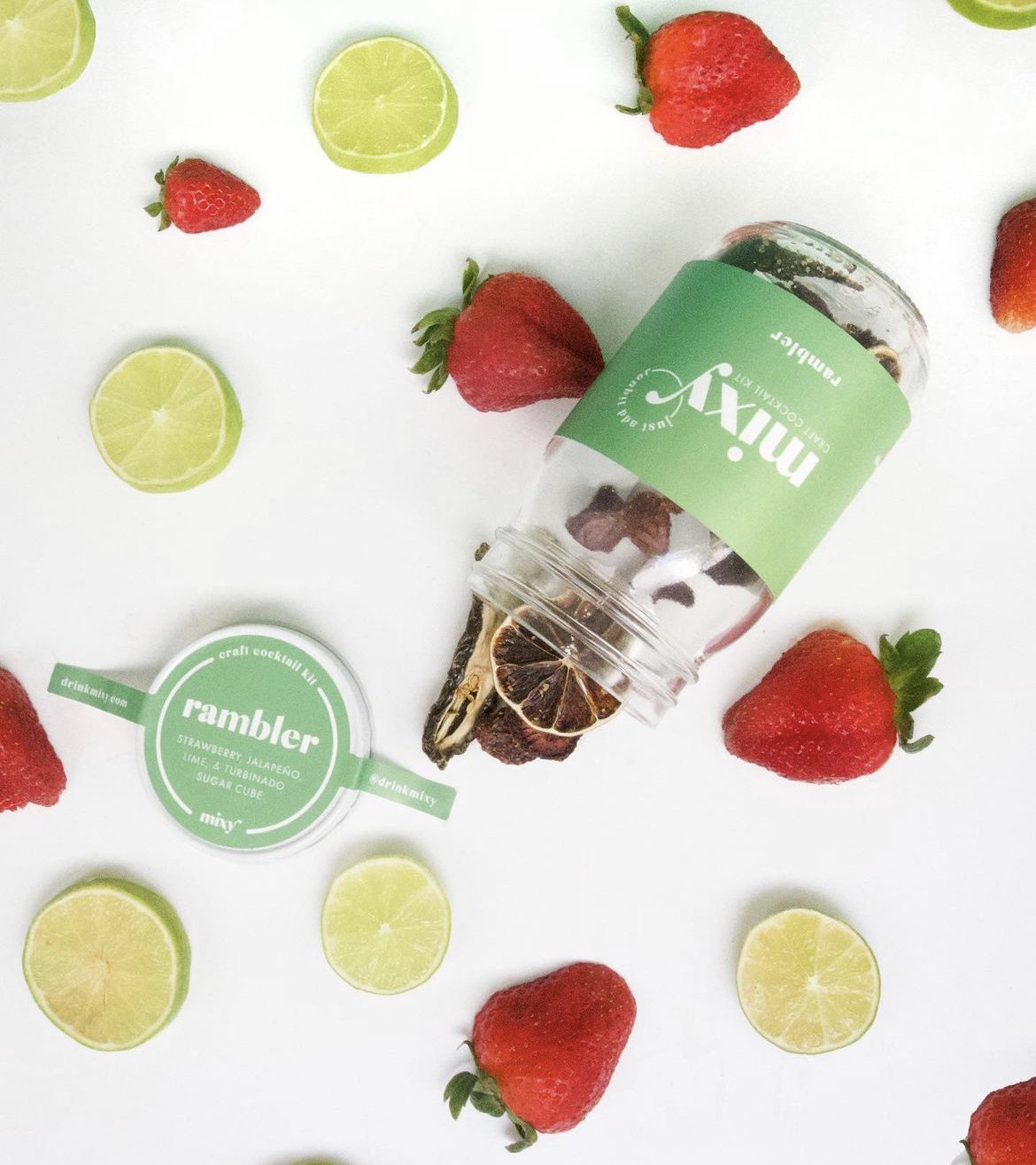
By using real fruits, veggies, and herbs in her products, we wanted to convey a sense of freshness, vibrancy, and natural goodness. The choice of bold, eye-catching colors serves as a visual representation of the delectable flavors and the joyous experience her products offer.
By captivating the target market's attention with these lively colors, we aim to create an immediate connection and evoke a sense of excitement and curiosity, enticing them to explore and indulge in the delicious world she has crafted.
In selecting the typography for our client's brand, we aimed to strike a harmonious balance between professionalism, uniqueness, and approachability. The combination of serif and sans serif fonts allows us to blend classic elegance with modern simplicity.
The use of a bold, unique, and fun font for the headline adds a touch of personality and captures attention, instantly conveying the brand's distinctive character.
To ensure readability and a clean, contemporary feel, we opted for sleek and modern fonts for the body copy, promoting clarity and ease of communication.
This typography selection not only enhances the overall aesthetic appeal but also reflects the brand's values of being both captivating and reliable, leaving a lasting impression on the audience.
Typography

With a new brand as a powerful catalyst, MIXY is poised to seize new growth opportunities and propel business to new heights in the retail and wholesale landscape.
Here’s what they had to say about their experience:
“The final product brought me to tears because it perfectly captured what I always hoped Mixy would grow into - a sophisticated, fun, simple and punchy brand.
Meredith Levesque
MIXY Founder


